As you may have seen by now, the Toronto Raptors unveiled two new uniforms to be worn during the upcoming 2016-17 season.
The jersey’s sparked a fair bit of debate (for the record, a healthy majority of Sportsnet readers said they favoured the new blue ‘Huskies’ uni to the red Chinese New Year jersey), and naturally led to determining where the new looks sat on the list of best and worst Raptors jerseys of all-time. While there hasn’t been a ton of variation, for a franchise that’s only been around a little more than 20 years there sure have been plenty too choose from.
So we polled the office and had SN staffers rate each jersey (not every one made the cut, like, for example, this) and averaged out our scores on a scale of Barney to Indominus Rex (or, you know, 1 to 5).
So without further ado, here are the definite rankings of the best (and worst) Toronto Raptors jerseys of all-time:
15. Military Night
These camouflage uni’s got a fair bit of usage given how over-the-top gimmicky they are. While it was a cool idea on paper, in execution it left a whole lot to be desired.

Dino-scale: Barney (average score: 1.75)
14. St. Paddy’s Day
Like the military threads, the overall consensus on these green jerseys was the same: they’re bad.

Dino-scale: Barney (average score: 1.9)
13. Away (’06-15)
The longest tenured and most familiar look, the red has stuck as the primary road colour while the bizarre pavement markings along the side may have seen tweaks in recent years but are still, regrettably, a constant in the Raptors jersey design.

Dino-scale: Steffon, the toy dinosaur from Clifford (average score: 2.7)
12. Home (’99-06)
Even with the latest design overhaul last season, it seems these standards from the height of the Vince Carter era have remained the jumping off point for all Raptors jerseys since.

Dino-scale: Theodore Rex (average score: 2.9)
11. Away (’99-03)
The jersey worn during some of the most iconic Raptor moments, including the 2000 dunk contest and the Carter-Iverson playoff duels.

Dino-scale: The dad from Dinosaurs (average score: 3)
10. Chinese New Year
One of the two new jerseys introduced this week, the dragon’s head is there because it turns out “Raptors” and “Dragon” share the same Chinese characters. Hey, at least this is way better than the Houston Rockets McDonald’s look from a little while back.

Dino-scale: The dad from Dinosaurs (average score: 3.06)
9. Tie– Home (’06-15)/Away (current)
The home jerseys below were getting pretty tired, so the change was welcome. A little surprised the clean, new-look red away jersey didn’t land higher on this list.

Dino-scale: The dad from Dinosaurs (average score: 3.07)
7. Home (current)
Clean, simple, the silver/grey waistband is a nice subtle accent while the lettering, too, is small and simplistic. Seems the designers really embraced the “less is more” mantra.

Dino-scale: The Flinstones’ Dino (average score: 3.13)
6. Black alternates (current, red and “OVO” gold)
A mirror image of the current red away jerseys, just with different colouring. Perhaps not the most creative, but a team clad in black is always a strong look (think: Oakland Raiders, Spurs). For the Drake version, the team just replaces the red piping for gold. This pair continues the run of jersey’s we’re mostly just lukewarm about.

Dino-scale: The Flinstones’ Dino (average score: 3.2)
5. Tie- Home (95-99)/Huskies white (2009)
The white version of the famous dinosaur jerseys never gets as much attention as the purple version, but I suppose it has it’s own charm (though it’s been widely ridiculed since inception- the odd zig-zag stripes certainly don’t help). The original ‘Huskies’ throwback jerseys were popular when first released, but the faux-belt is divisive, to say the least.


Dino-scale: Littlefoot from The Land Before Time (average score: 3.625)
3. Huskies (current)
The second new uniform released this week, it’s incredibly simple and that’s the charm. The blue-and-white is a nod to the original 1946 ‘Huskies’ look, and also coincides with the cities other major sports teams, the Maple Leafs and Blue Jays.

Dino-scale: Littlefoot from The Land Before Time (average score: 3.625)
2. Away (’95-99)
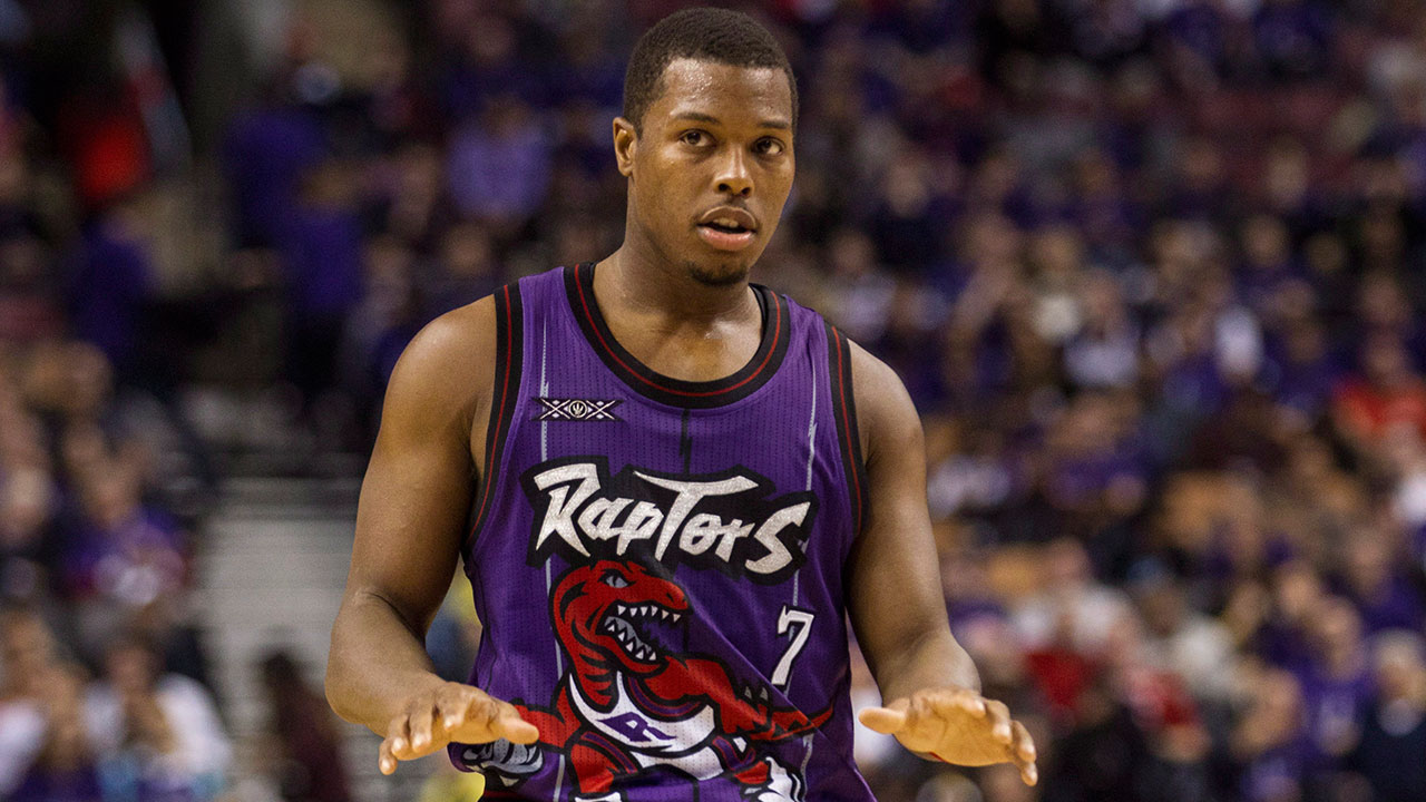
It’s hard to imagine a jersey more profoundly ’90s than this. The loud purple, the giant cartoon Raptor across the front, the zig-zags and gaudy lettering. What a time to be alive.
When it comes to their spot on these rankings, I think staff writer Ryan Dixon put it best: “Nostalgia always plays too strong a role in this; I’m sure I didn’t like the old ones as much when they came out.”

Dino-scale: Littlefoot from The Land Before Time (average score: 4)
1. Purple throwbacks
Again, I don’t think these jerseys were especially beloved when the Raptors first wore them, but when they were re-introduced as throwback two seasons ago people really seemed to love ’em. Turns out you can include Sportsnet staffers in that group.

Dino-scale: Indominus Rex (average score: 4.6)
Which jersey is your favourite? What’s the prized possesion in your collection? Or the most regrettable Raptors uni you’ve purchased? Let us know in the comments below.


