Thinking of the Anaheim Ducks’ beginnings as the Disney-owned Mighty Ducks of Anaheim, the image of that cartoony logo and eggplant and jade colour scheme instantly pops to mind.
With the Ducks reaching the conference final for the first time since 2007 — the season they switched their logo — Todd Radom of The Sporting News took a great inside look at the process by which the newly branded Ducks arrived at their not-so-goofy current trademark.
MORE: Which NHL teams unveiling new sweaters in 2015?
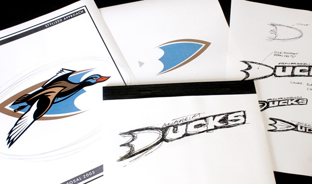
With ownership wanting colours representative of Orange County, ditching the purple was a quick decision, but designing the Ducks’ D was a long process that involved plenty of research and a pile of rough drafts.
Sports branding firm Frederick & Froberg Design Office was charged with the task. Creative director Bill Frederick explained in detail to Radom how he arrived at the current logo and provided him with early sketches.
“We started by prioritizing all of the design styles that we could, and should, explore,” Frederick said. “We used examples such as the Atlanta Thrashers logo as representative of a highly stylized approach and the Philadelphia Eagles, which represented an illustrative-animated style and so on. We also talked about the possibility of evolving the Disney-designed mark.

“It became clear that the owners and management didn’t want an angry duck, an animated duck, an aggressive duck, or an ornithologically correct duck,“ Frederick explained. “Our discussion turned to eliminating an image of a literally depicted duck entirely, and we took a piece of one logo exploration that used a stylized duck foot as a graphic holding shape that also formed the shape of a capital D.”
Check out the full article here for more sketches.
(image via The Sporting News)


