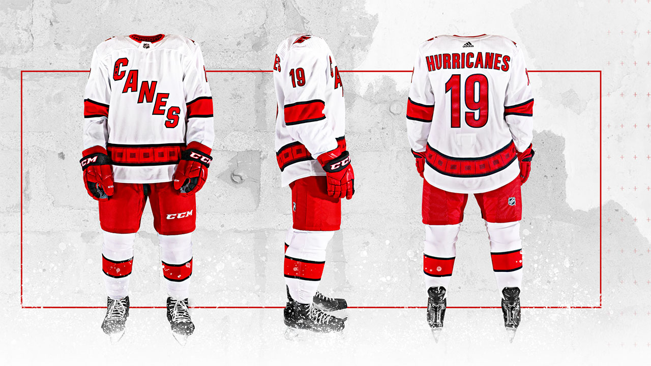
The Carolina Hurricanes will be donning new road uniforms this season, featuring a Canes letter logo across the front.
The white uniforms with red pants and stripes also include redesigns of features from the team’s other jersey sets. A new black and red version the team’s primary hurricane logo appears on the helmet, the team’s secondary flag logo now sits on both shoulders, and variations of that flag logo can be seen on the waistline and “C” in the word Canes across the front.
“We looked at many options in the creative process and ultimately decided that we wanted to make this jersey stand apart from our home and third jerseys,” Mike Forman, Hurricanes vice president of marketing and brand strategy said in an interview with Icethetics.com. “This uniform is intended to be a modern take on our classic road jersey.”
The biggest addition to the uniform is the Canes letter logo that sits diagonally across the front. The look calls to mind similar jerseys from the New York Rangers and Tampa Bay Lightning.
“We are proud of our new word marks that were introduced prior to last season,” Forman said. “Our ‘Canes’ nickname is how the vast majority of our fans affectionately refer to us and we want to bring a piece of our fans with us on the road by featuring it as the crest logo.”
According to the Hurricanes, the font will be consistent across all three team uniforms, but the new road jerseys will have red letters and a black border. The team will continue to play with their red home uniform, which features their primary hurricane logo, as well as the black jersey with their flag and green Hartford Whalers alternate jerseys they debuted last season. According to Icethetics, the Whalers jersey will return for a home game against the Los Angeles Kings on Jan. 11.
“We feel that we now have the most diverse uniform set in the NHL with three uniforms that utilize three different brand assets as crest logos,” Forman said. “Not to mention a fourth uniform when you factor in our Whalers set.”
[relatedlinks]


