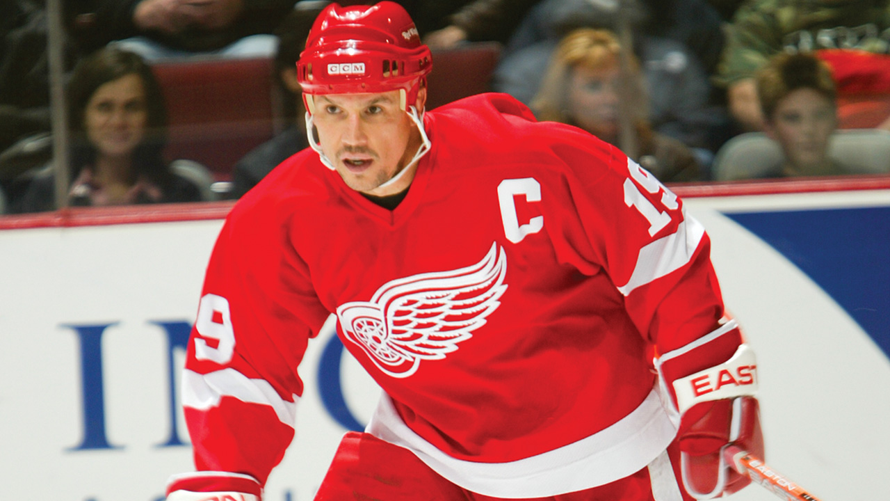
Get yourself a pencil and paper and try to draw the Red Wings logo. Go ahead, we’ll wait.
Nope. That one looks like crap. Try again. Nope—still not even close. Unless you’re a graphic artist—or you’re cheating and tracing this page—you probably can’t do it. The logo looks simple and clean, but it’s just too complicated to draw easily by hand. Much in the same way that, through most of their history, other hockey teams have been trying to copy the Red Wings’ formula, only to find that something’s not quite right.
Chicago grain merchant James Norris bought the team in 1932, when they were still the Detroit Falcons, and immediately recognized the need to sell tickets to local auto workers and their families. The answer? A name and logo that conjures up both the blue-collar, rubber-meets-road toughness of the Big Three and the soaring, creative spirit that would captivate the companies’ workers looking to dream during their hours away from the assembly lines. Norris even drew the team’s first logo, keeping the red-and-white colour scheme from the team’s previous iterations—and it’s changed only slightly in the 80 years since.
The auto workers embraced the Red Wings and remained connected to the sweater as the team’s personality changed through the decades. The Production Line and the workmanlike goaltending of Terry Sawchuck gave way to the grinding disappointment of the “Dead Things” era. The team endured hardships, like the city of Detroit itself would, until Steve Yzerman came to town and the culture gradually changed again. Starting in the late ’80s and continuing today, the Red Wings came to represent another sort of assembly line, a system in which dozens of parts work in the kind of harmony that recalls a machine at peak efficiency—with players from across the world serving as spokes in the greater wheel.
No other crest has been so synonymous with both the styles of the men who have worn it and the city it calls home. The winged wheel has a simple outline, but the details are intricate. It’s red and angry, but it’s also pure and white. It’s rough and tumble—think of Gordie Howe and his elbows—and the red helps hide the bloodstains. But it’s also sleek and elegant—think of Nicklas Lidstrom effortlessly stepping away from a hit to make a pass—and the smooth white accents suggest creativity and economy of motion. You can recognize it in an instant, but you couldn’t reproduce it from memory worth a damn.
This story originally appeared in Sportsnet magazine. Subscribe here.

